01PREMIUM
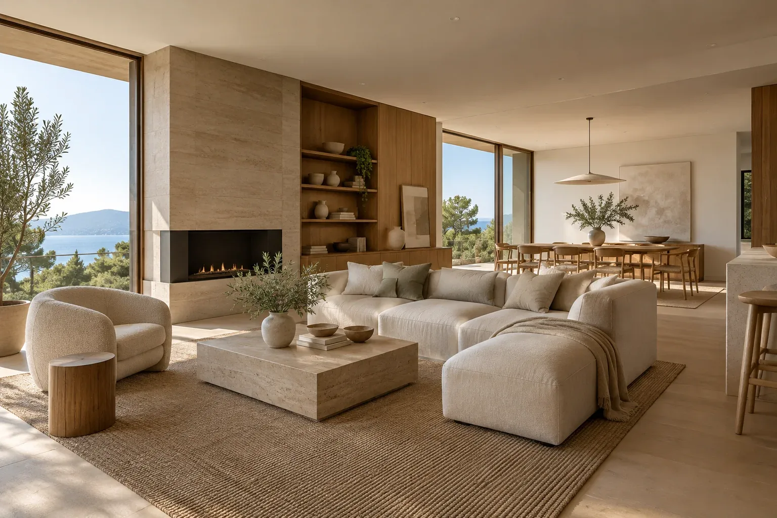
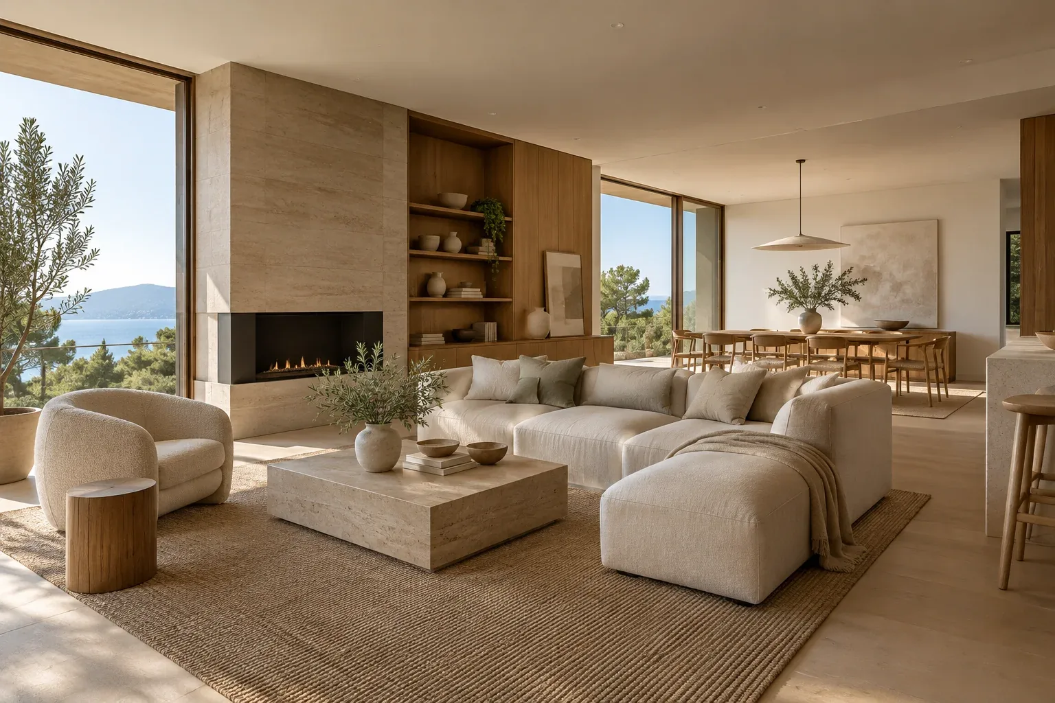
Warm Contemporary
Residential · Calm · Premium
Soft warm neutrals, natural walnut and quiet metallic accents for a timeless, comfortable interior.
Works well for: Living, dining, master bedroom

DESIGN · MATERIALS · REAL SPACES
Design before you decide.Explore curated mood boards, tactile material ideas and practical interior guidance. Compare directions, build a palette and send your design brief directly to Third Vision.
01 / MOOD BOARDS
Filter by room and finish level, compare two design directions, then apply a preferred style directly to your project brief.
Soft warm neutrals, natural walnut and quiet metallic accents for a timeless, comfortable interior.
Balanced greys, light oak and matte surfaces for open, practical spaces with easy long-term maintenance.
Charcoal, dark veneer, smoked glass and warm metal accents used selectively for a dramatic premium atmosphere.
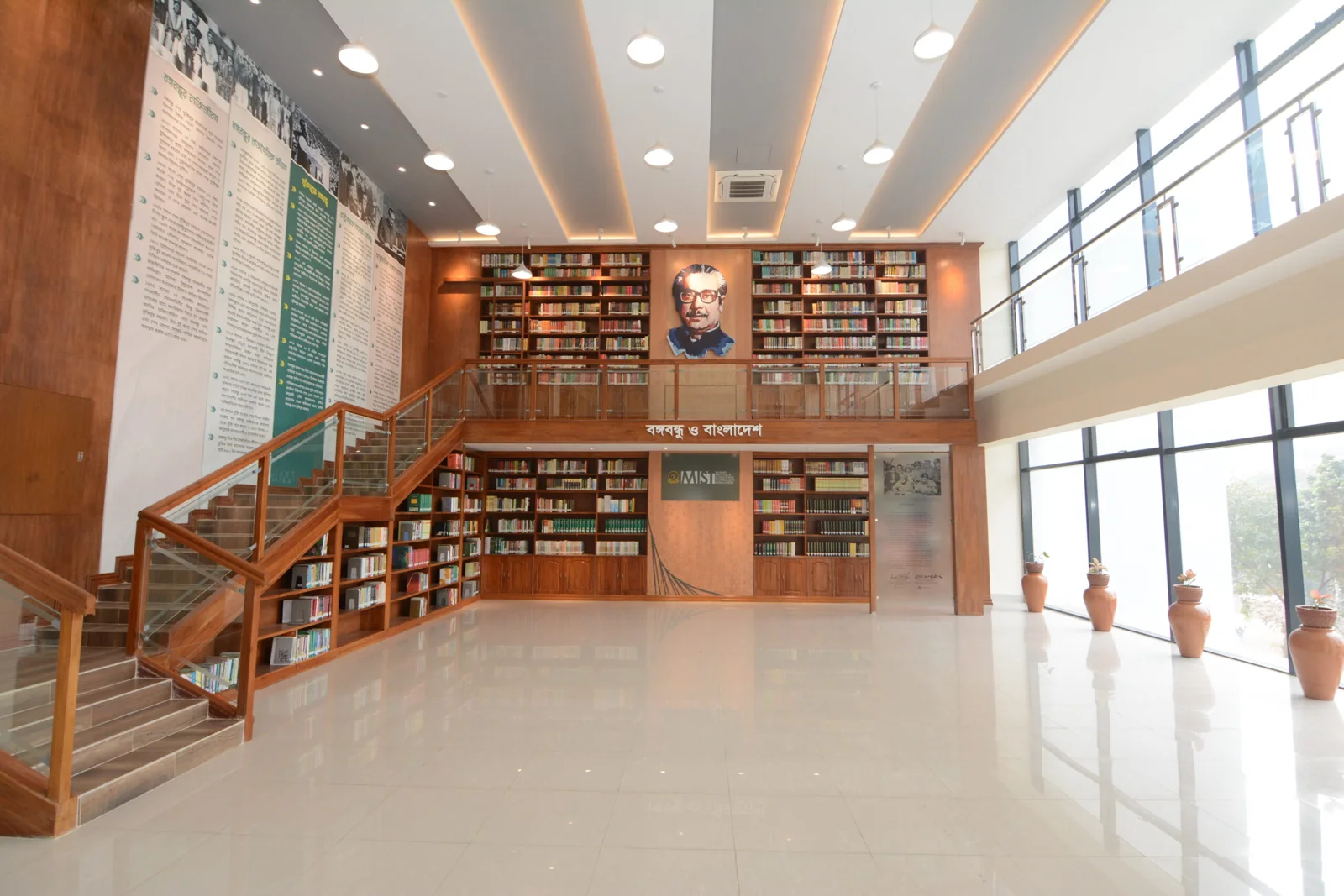
Light surfaces, acoustic textures and restrained color designed for productive corporate and institutional environments.
Pale oak, stone, soft clay tones and restrained detailing for calm spaces with a natural tactile character.
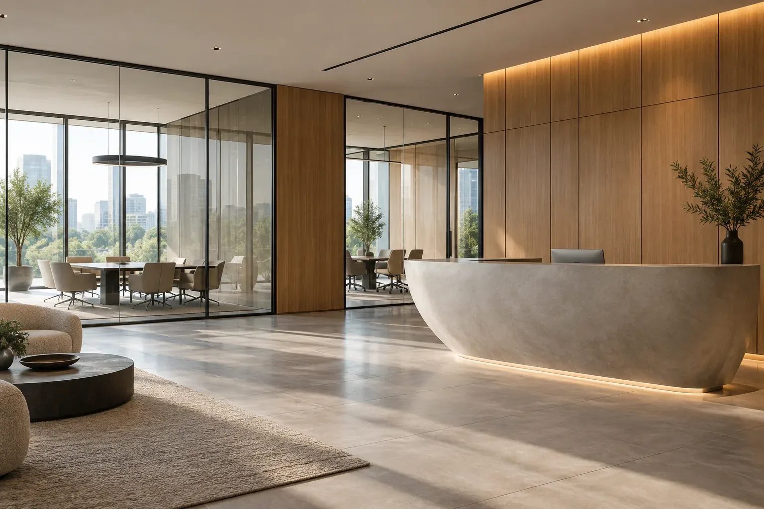
Clean black, white and ash with controlled contrast for an architectural look that feels precise rather than cold.
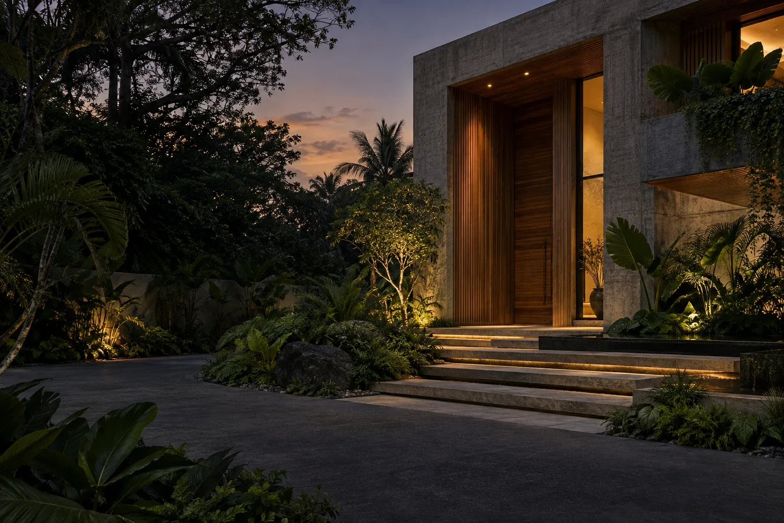
Muted olive, clay and warm wood tones create a grounded palette that works well with natural light and soft textures.
High-contrast stone, metal and controlled lighting create a polished backdrop that keeps products and brand identity in focus.
02 / MATERIAL INTELLIGENCE
Explore finishes with realistic pairing guidance. Tap any material to add it to your live palette, then carry that palette into your consultation brief.
 +
+Good for: Cabinetry, wall panels, furniture
Pairs with: Travertine, warm white, brass
Use moisture-resistant substrate in humid areas; keep grain direction consistent.
 +
+Good for: Flooring, counters, feature walls
Pairs with: Walnut, cream paint, brass
Choose slip rating, joint size and edge detail to suit the location.
 +
+Good for: Feature walls, reception, bathrooms with approved system
Pairs with: Oak, black metal, soft textile
Substrate preparation and sealing are critical for a durable finish.
 +
+Good for: TV wall, headboard, reception backdrop
Pairs with: Stone, paint, integrated light
Use selectively; allow for dust cleaning and edge detailing.
 +
+Good for: Sofa, lounge chair, headboard, soft accents
Pairs with: Walnut, travertine, warm white
Check cleanability, abrasion rating and stain performance for actual use.
 +
+Good for: Handles, trims, feature lighting, signage
Pairs with: Dark veneer, stone, smoked glass
Use one consistent brass tone and limit it to focal details.
 +
+Good for: Cabinet shutters, partitions, display, feature panels
Pairs with: Dark veneer, black metal, brass
Balance transparency, privacy, safety specification and cleaning access.
 +
+Good for: Office, auditorium, meeting room, library
Pairs with: Light oak, glass, neutral paint
Select by acoustic need, fire rating and cleanability—not appearance alone.
 +
+Good for: Flooring, reception counter, café, wash area
Pairs with: Oak, olive, matte black
Control aggregate scale and grout/joint color so the pattern does not become visually busy.
 +
+Good for: Frames, handles, shelving, lighting, partitions
Pairs with: Oak, clear glass, concrete tones
Use durable powder coat and avoid excessive black in low-light spaces.
Good for: Main walls, bedrooms, living, office
Pairs with: Almost any warm wood or stone
Sample under the actual artificial and daylight conditions before final selection.
Good for: Display, premium partitions, showcases
Pairs with: Metal, stone, veneer
Use laminated/tempered specification where safety requires it and plan cleaning access.
03 / BUILD MY MOOD BOARD
Select style, room, budget, accent color and materials. Your brief updates live and can be copied, downloaded, shared or sent to Third Vision.
04 / INTERIOR EFFECTIVENESS
Interior design should improve the everyday performance of a space. Explore the outcomes that matter beyond appearance.
Planning circulation, furniture and storage together can reduce wasted areas and make the same floor area work harder.
↗Layered ambient, task and accent lighting supports different activities while reducing glare and visual fatigue.
↗The right surface is selected for durability, maintenance, moisture, traffic and budget—not appearance alone.
↗Dimensions, reach, seating, work heights and movement are coordinated around real users and activities.
↗Color, proportion, furniture and details work as one system instead of competing individual elements.
↗Good detailing considers site conditions, services, procurement and construction sequence before work begins.
↗05 / THIRD VISION APPROACH
These are practical capabilities clients can evaluate when choosing a design-and-execution partner—not broad marketing claims.
Architecture, interior, construction coordination and visualization can be developed through one connected workflow.
3D renders, 360° views and supported walkthroughs help clients review decisions before site execution.
Material availability, buildability, maintenance and budget implications are considered during design development.
Project scope, material intent and BOQ-based coordination can be organized before procurement and execution.
Our portfolio includes residential, corporate, institutional, landscape and construction work.
The same project story can move from requirement and design through coordination, execution and final presentation.
06 / PROJECT PLANNER
Tell us the project type, area and expected quality. Rate-based estimates are disabled until Third Vision confirms its current rate bands.
Planning estimate only. Final cost depends on design, specification, site condition, quantity and current market rates.
Request a detailed consultation ↗FROM IDEA TO EXECUTION
Save the direction you like, add materials, and send the brief with your project enquiry.
SIDE-BY-SIDE